The 2025 Website Media Optimization Cheat Sheet: Image, Video & Asset Sizes That Actually Work
In 2025, website performance is no longer a technical afterthought — it’s a core part of design. Search ranking, conversion rate, and UX all depend on how fast your pages load. At Iridium Works, we reviewed the latest data and best practices to build a future-proof guide for optimizing visual assets. Here’s what you should know about image, video, and media sizing - both now and looking forward.
🖼️ Image Optimization
| Use Case |
Recommended Max Dimensions |
Target File Size |
Best Format |
Notes |
| Hero / Banner |
1920 px width |
≤ 400 kB |
WebP / AVIF |
For retina displays you can serve 2× versions via srcset. |
| Inline / Blog Images |
1200 px long edge |
≤ 200 kB |
WebP / JPEG |
Balanced for responsive layouts. |
| Thumbnails |
300–600 px |
≤ 100 kB |
WebP / PNG |
Consider placeholder blurs for lazy loading. |
| Icons / Logos |
Vector (SVG) |
Tiny |
SVG |
Scales infinitely, perfect for high DPI screens. |
💡 Pro tips:
- Use responsive images (srcset, sizes) to deliver the smallest necessary version.
- Compress intelligently — tools like Squoosh, TinyPNG, or Cloudinary work wonders.
- Strip EXIF / metadata.
- Target a total image payload < 1.5 MB per page for fast performance.
🎥 Video Optimization
| Use Case |
Resolution |
Max File Size |
Notes |
| Hero / Background video |
720p (1280×720) |
≤ 5 MB |
Loop, mute, autoplay, < 10 s duration. |
| Embedded / Content video |
1080p (1920×1080) |
Adaptive |
Use YouTube, Vimeo, or HLS streaming. |
| Animation / Micro-motion |
Lottie / WebM |
≤ 1 MB |
Vector animation beats GIFs for weight and clarity. |
What to do in 2025?
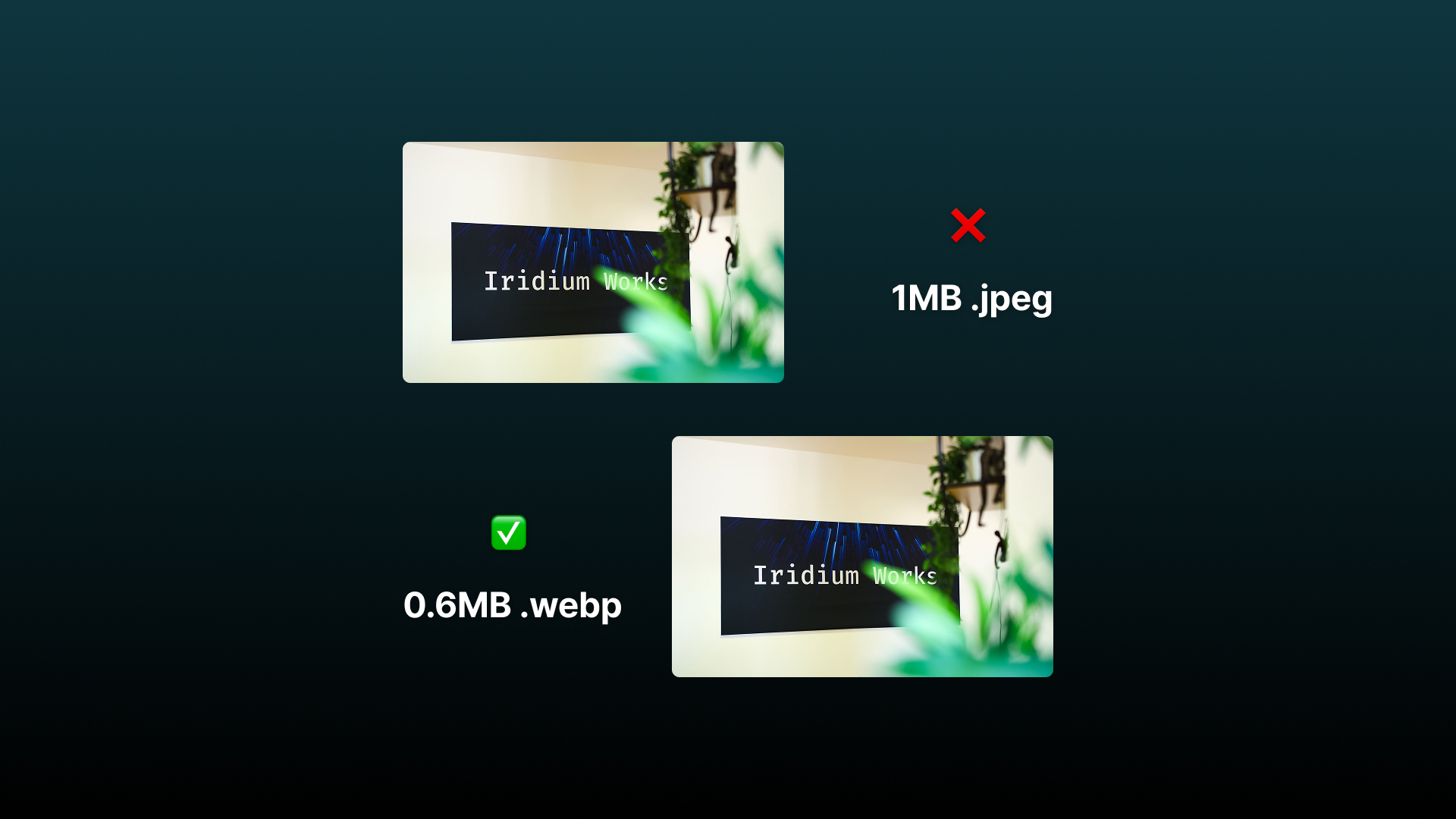
WebP is the image format that made websites lighter and faster — without anyone noticing the difference in quality. It’s efficient, future-proof, and fully supported. If your site still uses JPEG or PNG, you’re leaving speed and SEO points on the table.
What Is the WebP Format?
WebP is a modern image format developed by Google that provides superior compression compared to older formats like JPEG and PNG - without visibly losing quality. Think of it as the “smart compression” format for the modern web: smaller files, faster load times, same visual quality.
How WebP Works
WebP supports both lossy and lossless compression, meaning it can handle almost every image type on your site:
| Feature |
Description |
| Lossy Compression |
Similar to JPEG — discards some data to shrink the file, but looks nearly identical to the original. Great for photos. |
| Lossless Compression |
Like PNG — keeps every pixel intact, ideal for logos, UI icons, and graphics. |
| Transparency (Alpha Channel) |
Like PNG — supports transparent backgrounds even in lossy mode. |
| Animation |
Like GIF — supports multiple frames for animated WebP images (but far smaller file sizes). |
| Metadata Support |
Retains EXIF, ICC color profiles, and XMP metadata if needed. |
📊 Performance Advantages
| Format |
Compression Efficiency |
Transparency |
Animation |
Browser Support (2025) |
| JPEG |
Baseline |
❌ |
❌ |
✅ |
| PNG |
High (lossless) |
✅ |
❌ |
✅ |
| GIF |
Very low |
✅ |
✅ |
✅ |
| WebP |
~25–35% smaller than JPEG (same quality) |
✅ |
✅ |
✅ (All major browsers) |
| AVIF (next-gen) |
~45–50% smaller than JPEG |
✅ |
✅ |
✅ (gaining adoption) |
In practice, a WebP image that looks identical to a 200 kB JPEG might only be 120 kB or less - a direct performance gain.
Browser & Platform Support (as of 2025)
✅ Full support across:
- Chrome, Edge, Firefox, Safari, Opera, Brave
- iOS (Safari 14+), Android, macOS, Windows, Linux
- WordPress, Shopify, Wix, Webflow, Squarespace, and all modern CMS platforms.
So - WebP is safe for production use on virtually every modern website.
Why You Should Use WebP on Your Website
- Faster page loads → Better UX & SEO.
- Reduced bandwidth → Lower hosting & CDN costs.
- Better Core Web Vitals → Improves Google rankings.
- Smaller storage footprint → Saves server space.
- Universal support → No more “fallback image” hacks needed.
A typical site that converts all JPEGs/PNGs to WebP sees 20–40% faster load times immediately.
Beyond 2025: What's next?
- AVIF & JPEG XL will become default across browsers.
- Dynamic image delivery (edge resizing) will be standard in CDNs.
- AI-based upscaling may allow ultra-light assets that look HD.
- Performance budgets will be part of design systems, not just dev ops.