Christian Huff
CFO

Five concrete signals that reveal whether your B2B website is actually generating business or just taking up space, and what to change about each one.
There is a specific kind of frustration we hear in almost every initial conversation with B2B companies. The website is live. It looks good. The SEO agency reports growing traffic numbers. Google Analytics confirms thousands of monthly visitors.
And yet: barely any inquiries. The few that come in are often unqualified. The sales team does not feel like the website is helping them. Marketing cannot point to a clear connection between the site and actual revenue.
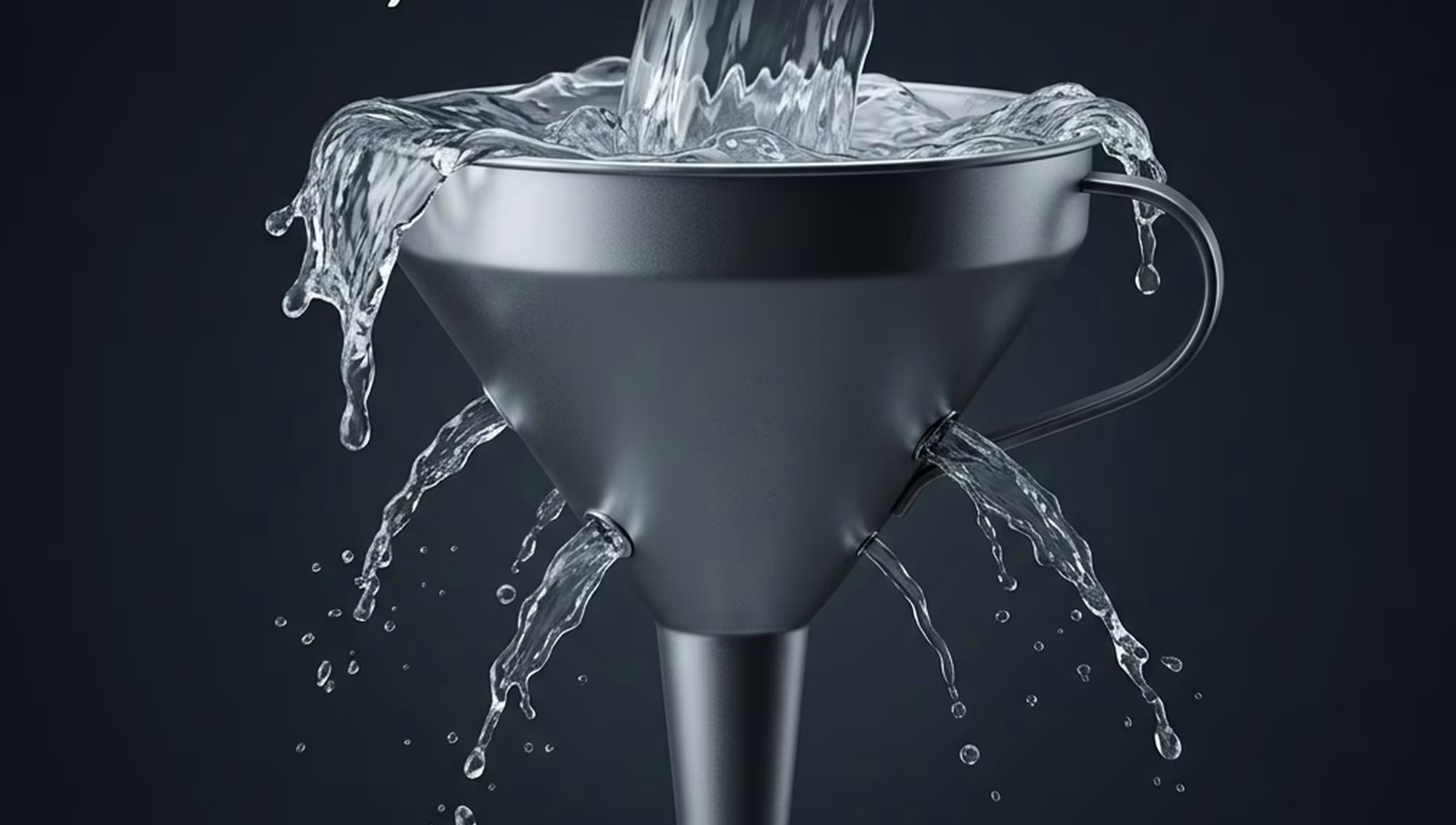
The instinct is usually to invest in more traffic. More SEO. More ads. More content. But after analyzing and rebuilding over 100 B2B websites in the past two years, we can say with confidence: for most companies, traffic is not the problem. What happens after someone arrives is.
This article breaks down five specific signals that tell you whether your website is working as a sales tool or just functioning as a digital business card. Each signal comes with a diagnosis and a direction for what to change.
This is the most obvious one, and the most commonly misdiagnosed. You have visitors. Thousands of them. But the conversion rate sits somewhere between 0.5% and 1%. For a B2B site with decent traffic, that often means single-digit leads per month.
The typical reaction is to question the traffic quality. Maybe the wrong people are visiting. Sometimes that is true. But more often, the visitors are right and the website is not giving them a reason to act.
This usually comes down to one thing: there is no clear conversion path. The visitor lands on the homepage, reads some general information, maybe clicks through to a service page, and then leaves. There is no moment on the site where the visitor thinks: yes, this is for me, and here is exactly what I should do now.
What to look at: Map out the journey from your highest-traffic entry pages to your contact or inquiry page. How many clicks does it take? How many distractions are in the way? Is there a compelling reason to reach out on every major page, or only on the contact page buried in the navigation?
Some websites have no clear call-to-action at all. The only way to get in touch is to find the contact page in the navigation. Others have the opposite problem: every page has five different buttons pointing in five different directions. Book a call. Download a whitepaper. Subscribe to the newsletter. Watch a webinar. Request a quote.
Both situations create the same result. The visitor does not know what the single most important next step is. When everything is a priority, nothing is a priority.
The websites that convert well do something simple: they have one primary action they want visitors to take. Everything else is secondary. That primary action is visible, clear, and consistent throughout the site. It is not competing with four other options for attention.
What to look at: Open your website right now and ask yourself honestly: What is the one thing I want a visitor to do? If you cannot answer that in one sentence, your visitors cannot figure it out either. And if you can answer it but your website does not reflect it clearly, that is the gap.
Your analytics show that most visitors land on the homepage and then leave. They do not click to a service page. They do not scroll to the case studies. They do not look for the contact page.
This is usually not a design problem. It is a relevance problem. The homepage does not immediately communicate what you do, who you do it for, and why the visitor should care. Instead, it talks about the company. Our history. Our values. Our team. Our awards.
None of that matters to a first-time visitor who found you through a Google search and is trying to figure out if you can solve their problem. They need to see themselves reflected in the first few seconds. Not your company story, but their challenge.
What to look at: Read the first visible section of your homepage as if you have never heard of your company. Does it answer three questions within five seconds: What do you do? Who is it for? What should I do next? If it takes scrolling or clicking to get those answers, you are losing people before they even start.
This signal is sneaky because it feels like the website is working. Inquiries are coming in. The form gets filled out. But when sales follows up, most of them are a poor fit. Wrong budget, wrong scope, wrong expectations.
This almost always means the website is attracting attention but not setting the right expectations. The messaging is too broad. It speaks to everyone instead of to the specific type of client you actually want to work with. There is no filtering happening before someone reaches out.
A website that functions as a sales tool does not just generate leads. It pre-qualifies them. It communicates clearly who you are the right fit for and, equally important, who you are not. It sets expectations on pricing, on process, on what working together looks like. By the time someone fills out the form, they already have a realistic picture.
What to look at: Read your service descriptions and ask yourself: Could a company with a 2,000 EUR budget and a company with a 50,000 EUR budget both think this is for them? If yes, the messaging is too vague. The more specific you are about who your ideal client is, the more qualified the inquiries become.
You would be surprised how many B2B websites invest heavily in design, content, and SEO, and then have a contact page that says: "Get in touch. Fill out the form below." Name. Email. Message. Submit.
That is not a conversion experience. That is a formality. And it is the last impression before someone decides to reach out or close the tab.
The contact page, or whatever your primary conversion point is, should be the hardest-working page on your entire site. It should reinforce trust. It should remove doubts. It should make the visitor feel confident that reaching out is worth their time.
What does a strong contact experience look like? It tells the visitor what happens after they submit. It gives a realistic timeline. It might show a face and a name instead of a generic form. It restates the core value proposition one more time. It feels like the natural conclusion of everything the visitor has read so far, not like an administrative step they have to get through.
What to look at: Visit your own contact page as if you were a potential client. Does it make you want to reach out? Does it answer the question "what happens next?" If it feels cold, generic, or disconnected from the rest of the site, that is costing you conversions.
These five signals have one thing in common: none of them are about how your website looks. They are about how your website works. About whether it guides visitors toward a decision or leaves them to figure it out on their own.
A website that functions as a business card presents information. It says: here is who we are, here is what we offer. It is passive. It waits for the visitor to take initiative.
A website that functions as a sales tool is active. It identifies the visitor's problem, builds trust, removes barriers, and makes the next step obvious. It does the work that a good salesperson would do in a first meeting.
The shift from one to the other is not usually a complete rebuild. It is a strategic restructuring. Clearer positioning, focused calls-to-action, trust-building elements in the right places, a conversion path that makes sense.
If you recognized your website in two or more of these signals, the good news is: you already know where to start. The data is there. The visitors are there. What is missing is the bridge between traffic and action.
That bridge is what we build.
As CFO, Christian is responsible for the business side of Iridium Works. Over the years, he has built and managed several companies. Christian writes about digitalization, sales, and current market trends, and how Iridium's services impact its customers.
Access our exclusive whitepapers, expert webinars, and in-depth articles on the latest breakthroughs and strategic implications of webdesign, software development and AI.