Hover, Motion, Microcopy - Small UX Details with Huge Impact
In digital design, it’s often not the big visual elements that decide whether a user trusts a brand — it’s the details.
Tiny transitions, hover effects, or even a single reassuring sentence can turn a good interface into a great experience.
Below we’ll look at three of the most underrated UX tools — Hover, Motion, and Microcopy — and analyze where they shine and where they can backfire.
1. Hover Effects
Hover effects signal interactivity. They make static elements feel responsive, guiding the user’s attention without requiring extra effort.
Pros:
- Provide visual feedback and reduce uncertainty.
- Guide users through clickable elements intuitively.
- Add a sense of polish and responsiveness.
Cons:
- Can be overused and distract from content.
- Don’t exist on touch devices – poor fallback can confuse users.
- Excessive animations can slow performance.
Examples:
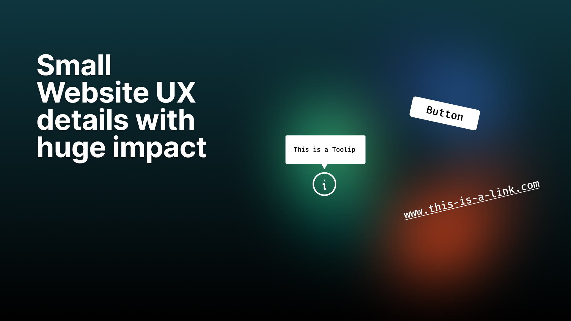
- Buttons with color changes:
A “Buy now” button slightly changes color or gains a shadow when hovered. This signals interactivity and makes the element feel more tactile.
- Product image zoom:
In online shops, hovering over a product image enlarges it or shows an alternate view (e.g., the back of a product). This sparks curiosity and invites interaction.
- Animated underline on links:
Instead of a static underline, a line smoothly slides in from left to right on hover – subtle yet elegant.
- Tooltips:
When hovering over an info or help icon (“i” or “?”), a short explanatory text appears – perfect for complex interfaces.
- Navigation highlights:
In a website menu, the hovered item becomes bold or changes color, guiding the user’s focus and improving orientation.
Pro tip:
Hover effects should serve a purpose – provide feedback or improve usability – rather than simply decorate.
2. Motion Design
Motion brings flow and rhythm to digital interfaces. Properly used, it creates a seamless experience and communicates hierarchy.
Pros:
- Focuses user attention and supports navigation.
- Helps users understand cause-and-effect (e.g., when a modal opens).
- Adds emotion and brand character.
Cons:
- Too much motion can feel overwhelming or disorienting.
- Poorly optimized motion can impact page speed.
- Inconsistent motion styles reduce trust.
Examples:
- Page transitions:
When switching between pages, content smoothly fades or slides in and out. This creates continuity and keeps users engaged.
- Button feedback:
After a click, a button briefly shrinks and bounces back – it feels “alive” and confirms the interaction.
- Loading animations:
Instead of a static “Loading...” message, use animated icons (like spinning logos or pulsing dots). This reassures users that progress is happening.
- Micro-transitions in forms:
When a user fills in a field correctly, a small checkmark fades in – a subtle yet satisfying confirmation.
- Onboarding animations:
Short, fluid motion sequences can explain how an app works – reducing complexity and increasing understanding.
- Parallax scrolling:
Background and foreground elements move at different speeds while scrolling, creating depth – but use sparingly to avoid distraction.
Pro tip:
Every animation should communicate something — feedback, focus, or emotion. If it doesn’t add meaning, it adds noise.
3. Microcopy
Microcopy are those tiny bits of text — tooltips, button labels, form messages — that make the interface human.
Pros:
- Builds trust through empathy and clarity.
- Reduces friction in forms and onboarding flows.
- Reinforces brand voice subtly.
Cons:
- Overly casual tone can feel unprofessional.
- Bad translations or inconsistencies reduce credibility.
- Too much text clutters the interface.
Examples:
- Form field hints:
Instead of “Invalid input,” say: “Please enter your email in the format name@example.com.” – clear, polite, and useful.
- Button labels:
Replace generic “Submit” with “Send message” or “Book now” – context-aware copy improves clarity.
- Empty states:
When a dashboard has no data yet: “You’ll see your projects here once you’ve created your first one.” – encouraging instead of confusing.
- Error messages:
Rather than “Error 404,” use: “Oops! This page seems to be missing. Try searching or go back to the homepage.” – empathetic and solution-oriented.
- Success messages:
“Your profile has been saved! 🎉” feels friendlier and more human than “Save complete.”
- Newsletter sign-up:
“Don’t worry, we hate spam as much as you do.” – builds trust and lowers friction.
- CTAs in brand voice:
Playful brand: “Let’s go! 🚀”
Serious brand: “Start now.”
Microcopy reinforces the tone of your brand.
Pro tip:
Good microcopy guides, reassures, and humanizes – it’s not filler text, it’s part of the experience.
Bringing It Together
When hover, motion, and microcopy align, they produce a sense of coherence that users can’t quite explain - but they feel it.
A clear hover response, a smooth transition, and a friendly message can collectively say: “You’re in good hands.”
Key Takeaway
Small details are where digital trust lives.
Design them intentionally, test them across devices, and let them enhance - not dominate - your website’s experience.