Christian Huff
CFO

Navigation shaped by company structure instead of visitor needs is costing you conversions. Here is how to restructure it around decision paths that actually work.
You know the feeling. You land on a website, and within five seconds you're asking yourself: "Where do I even begin?"
That's not an accident. It's a strategy problem that looks like a design problem.
Most business websites organize their navigation the same way they organize their departments. For the people who built the company, that's intuitive, which is exactly why it fails so spectacularly for the people who visit it. Your clients, prospects, and job applicants don't think in org charts. They think in problems, decisions, and next steps.
We have redesigned navigation systems for dozens of B2B companies across tech, consulting, manufacturing, and services. The pattern is always the same: the best navigation is not the prettiest one. It's the one that answers the single most important question each visitor needs answered right now.
Let's be honest. Your navigation probably maps your company structure, and that's the first problem.
It sounds reasonable. You have a team, so you have a "Team" page. You have services, so you list them all in a dropdown. You have an about section, a blog, a careers page, contact information. It's logical. It's complete. And it's very likely costing you visitors.
Here's why: every person who lands on your website has a specific context. A prospect exploring whether to hire you for a project is in a completely different mindset than someone applying for a job. Someone researching your approach for their specific industry needs different information than someone who's just beginning to understand the problem you solve.
When your navigation is organized around your company structure, all these different people have to search for what matters to them. The prospect has to dig through "Services" with 15 options. The job seeker has to find "Careers" somewhere in a dropdown. The person trying to understand your expertise has to click "About Us" or "Our Approach" and hope something fits.
It's friction. And friction costs you conversions.
A client came to us with navigation that looked professional on paper. Eight main navigation items. Each with multiple sub-items. The design was clean. The information architecture made sense to their internal teams. But the data told a different story. Bounce rates on key pages were above industry averages. Visitors were dropping off at the navigation level before they even reached the content.
We restructured their navigation in less than a day. Same content. Different organizational logic. Within two weeks, their conversion rate on the main call-to-action rose by 31%. Why? Because visitors actually found what they were looking for.
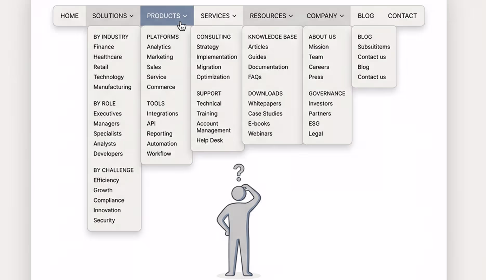
Here's a trap many websites fall into, especially as companies grow: the mega-menu. "We have so much great content," the thinking goes, "let's make sure everything is visible."
But there's a cognitive science principle at work here. Too many choices don't empower visitors. They paralyze them.
This is called decision paralysis, and it's well-documented in research. When you present someone with too many options, they either choose randomly (bad for you) or they don't choose at all (worse for you) and they leave.
A typical mega-menu might display 20–30 items spread across multiple columns. It looks comprehensive. It looks professional. But a visitor landing on your site doesn't think: "Great, 30 options to choose from." They think: "I don't know where to start," and they bounce.
The best navigation creates a clear path, not maximum visibility. It respects the visitor's cognitive load. It says: "Here are the main decisions you might be making, and here's where to go for each one."
An industrial client we worked with had a mega-menu displaying all their product categories prominently. It was their pride and joy, and it was confusing new visitors. We created a navigation that first asked the visitor's primary question: "Are you an engineer looking for specifications, a procurement officer looking for bulk pricing, or a designer exploring possibilities?" Only after that initial branch did they see the product categories relevant to their path.
Their engagement metrics improved dramatically. Why? Because they weren't overwhelmed. They were guided.
This is the core idea: your navigation should guide decisions, not catalogue content.
Think about the actual journey of a visitor on your website. They don't arrive hoping to see everything you have. They arrive because they have a question or a need. Your navigation should help them find the answer to their specific question as quickly as possible.
This is where the concept of "prioritized paths" comes in.
Every website has primary visitor types. For a B2B agency like us, there are three main types: prospects exploring whether to work with us, companies already working with us looking for additional services, and people interested in joining our team. Each of these groups has fundamentally different information needs.
A prospect needs to understand: do you solve my problem? Can I afford it? Who else have you solved it for? An existing client needs to know: how do I access ongoing support? What new services should I know about? A candidate needs to see: what's the culture like? What roles are available? How do I apply?
The best navigation systems recognize this. They create primary paths for each important visitor type. This doesn't mean hiding information. It means surfacing the right information at the right time.
Some of the most impactful navigation systems we've built use subtle segmentation. A navigation item that says "For Agencies" versus "For Brands" does real work. It acknowledges that different people need different entry points. A navigation that says "Already working with us?" creates a separate path for existing clients.
That's not complex. It's just intentional.
Here's something many companies miss: the right navigation structure depends on what your company actually does.
We've developed a framework called "The 4 Website Archetypes." They are different because they do fundamentally different jobs:
The Kundenmagnet is designed to attract ideal clients at scale. Its navigation prioritizes client problems and use cases. "Do you have this problem?" comes before "here's our process." The navigation leads to conversion actions like demo requests or consultations.
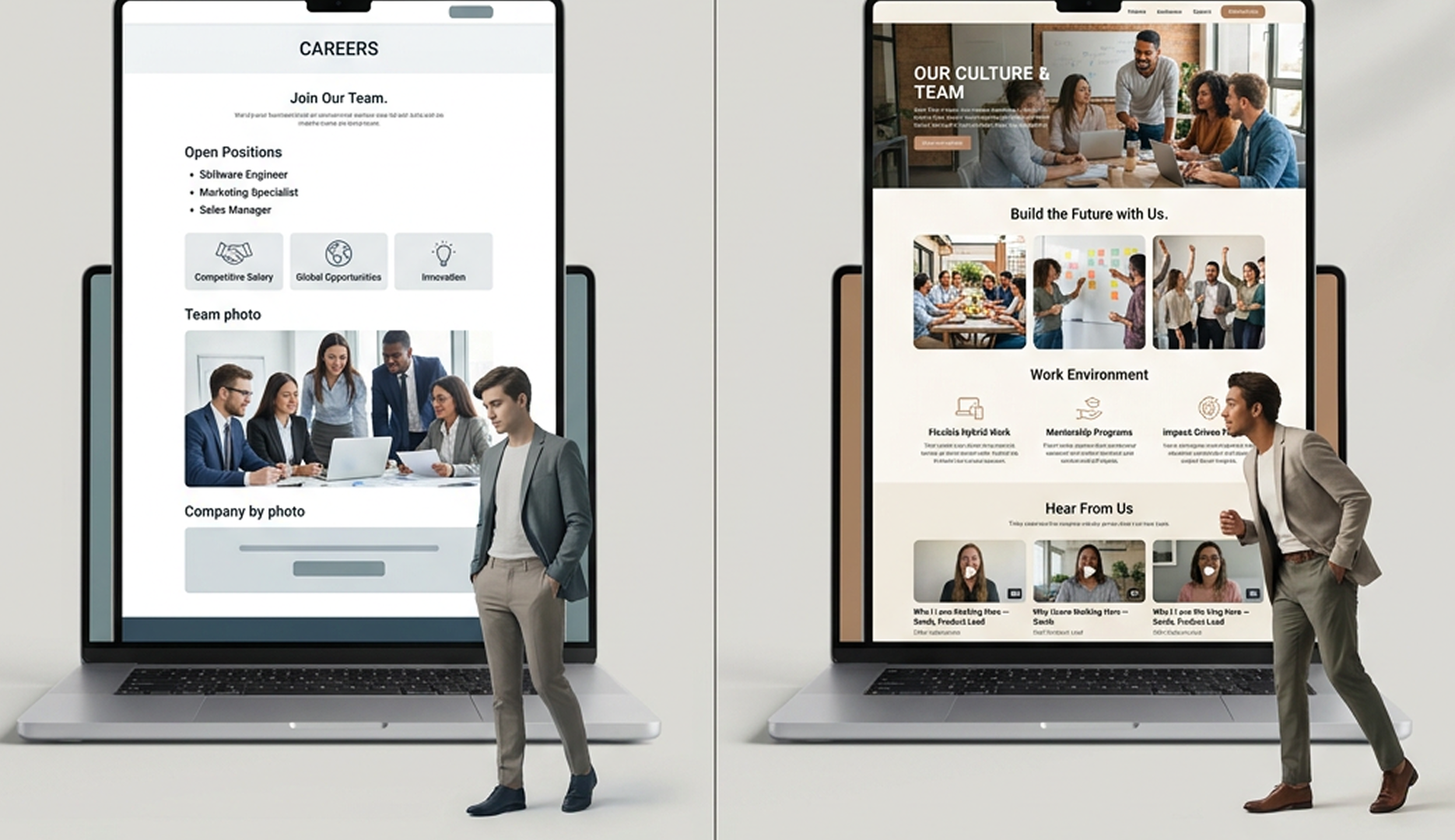
The Recruiting-Magnet is designed to attract talent. Its navigation looks completely different. Culture, team, opportunities, and growth come first. The path is shorter. The tone is warmer. The decision is more personal.
The Leistungs-Portfolio showcases complex work for sophisticated buyers. Its navigation emphasizes case studies, methodologies, and deep expertise. It builds credibility through detail.
The Investor-Pitch website has yet another structure. Traction metrics, team credibility, business model clarity, and growth story come first. The navigation serves a different decision-maker.
The same company might need multiple navigation systems if it serves multiple visitor types with fundamentally different needs. But most companies try to serve all these audiences with one generic navigation, and it serves none of them well.
A tech company came to us trying to be everything: a client magnet, a talent recruiter, and an investment story. Its navigation tried to be all three. It was a mess. We rebuilt it with clear primary and secondary paths: "Want to build?" and "Want to join us?" The second had its own sub-navigation system designed specifically for talent. Their recruitment metrics improved by 40% in the first quarter.
Let's look at a real example of navigation restructuring.
A B2B consulting firm came to us with this navigation: About Us | Services (with 12 sub-items) | Team | Industries | Case Studies | Insights | Careers | Contact
It looks complete. It's well organized. And it's entirely organized by company structure and content type.
Here's what we changed it to: For Clients | Our Approach | For Teams | Contact
What happened was subtle but powerful. "For Clients" had sub-items like "Strategic Planning," "Digital Transformation," "Talent Challenges" instead of "Services" and "Industries." These were buyer problems, not company departments. "For Teams" clearly separated the talent story from the client story.
The navigation was shorter. It was clearer. It immediately signaled what this company was for and who it was for.
Their conversion rate on the first key action (booking a consultation) went up 28%. Their careers page engagement went up 45%. Total time on site went up 18%.
Same company. Same content. Different navigation logic.
Another example: an industrial equipment manufacturer. Old navigation: Products (18 categories) | Specifications | Pricing | About Us | Support | Blog | Contact
New navigation: For Engineers (specs, technical docs, downloads) | For Procurement (pricing, bulk options, contracts) | For Designers (inspiration, materials, case studies) | Support | Contact
They were serving three completely different buyer personas with completely different information needs. The old navigation made more work for everyone. The new one gave each buyer type a clear path.
Their B2B marketplace leads went up 52%. Their technical documentation downloads tripled. Their inquiry quality improved because each visitor type got the information relevant to their decision, rather than drowning in information meant for other buyer types.
Navigation restructuring is not a one-time design project. It's an ongoing alignment between your business strategy and your digital presence.
Start with this question: who are our three primary visitor types, and what decision is each one trying to make when they land on our website?
For B2B companies, these are usually: a prospect deciding whether you can solve their problem, an existing client or partner accessing services or information, and a prospective employee or collaborator.
For each of these, ask: what's the first thing they need to know? What's their primary path through the website?
Then design your navigation around those paths, not your org chart.
This isn't about hiding information. It's about surfacing the right information at the right time. It's about respecting visitor context and cognitive load. It's about acknowledging that different people need different entry points.
The companies that do this see it in their metrics. Faster conversions. Lower bounce rates. Higher engagement. Better quality leads.
Your navigation is too important to leave to chance or default structures. It's a strategic tool. Use it like one.
As CFO, Christian is responsible for the business side of Iridium Works. Over the years, he has built and managed several companies. Christian writes about digitalization, sales, and current market trends, and how Iridium's services impact its customers.
Access our exclusive whitepapers, expert webinars, and in-depth articles on the latest breakthroughs and strategic implications of webdesign, software development and AI.