Christian Huff
CFO

Your homepage is your first impression. These 7 elements determine whether visitors stay or leave.
The homepage is the most visited page on every business website. And at the same time, the page that is most often built wrong.
Not wrong in a technical sense. Most homepages load fast, look tidy, and work on smartphones. Wrong in a strategic sense. They talk about the company instead of the visitor. They show everything at once instead of guiding the visitor deliberately. And they hope that someone, somewhere, will click on "Contact".
In our work with companies across different industries, we have identified 7 elements that a homepage needs if it is going to do more than look good — if it is actually going to win clients.
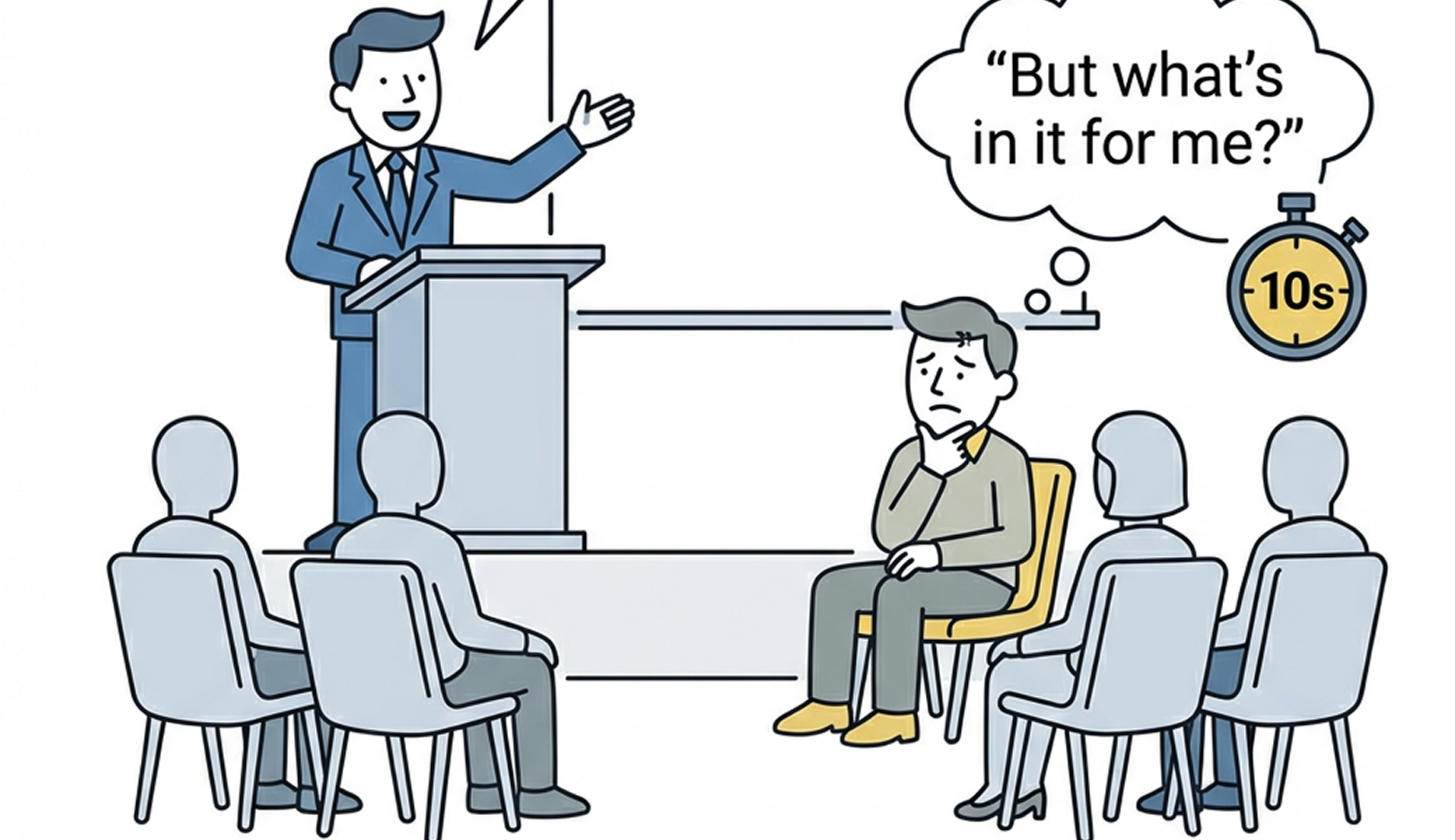
Most homepages begin with the company. "Welcome to [Name]. We have been your partner for [service] since [year]."
The problem: the visitor does not know you yet. They are not interested in your story. They are interested in their problem.
A better opening speaks directly to that problem. "Are you losing qualified leads because your website has no clear call to action?" That is a sentence that makes the visitor keep reading. Because they feel recognized.
Directly after the problem statement, the visitor needs to understand what you do and why it is relevant to them. Not in three paragraphs. In one sentence.
That sentence should be clear enough that someone who has never heard of your company immediately understands whether they are in the right place. "We build websites that measurably win clients" is a clear benefit. "We offer holistic digital solutions for the mid-market" is not.
Trust is not built through claims. It is built through evidence. And that evidence needs to appear early. Not hidden on a subpage that only those who search for it will find.
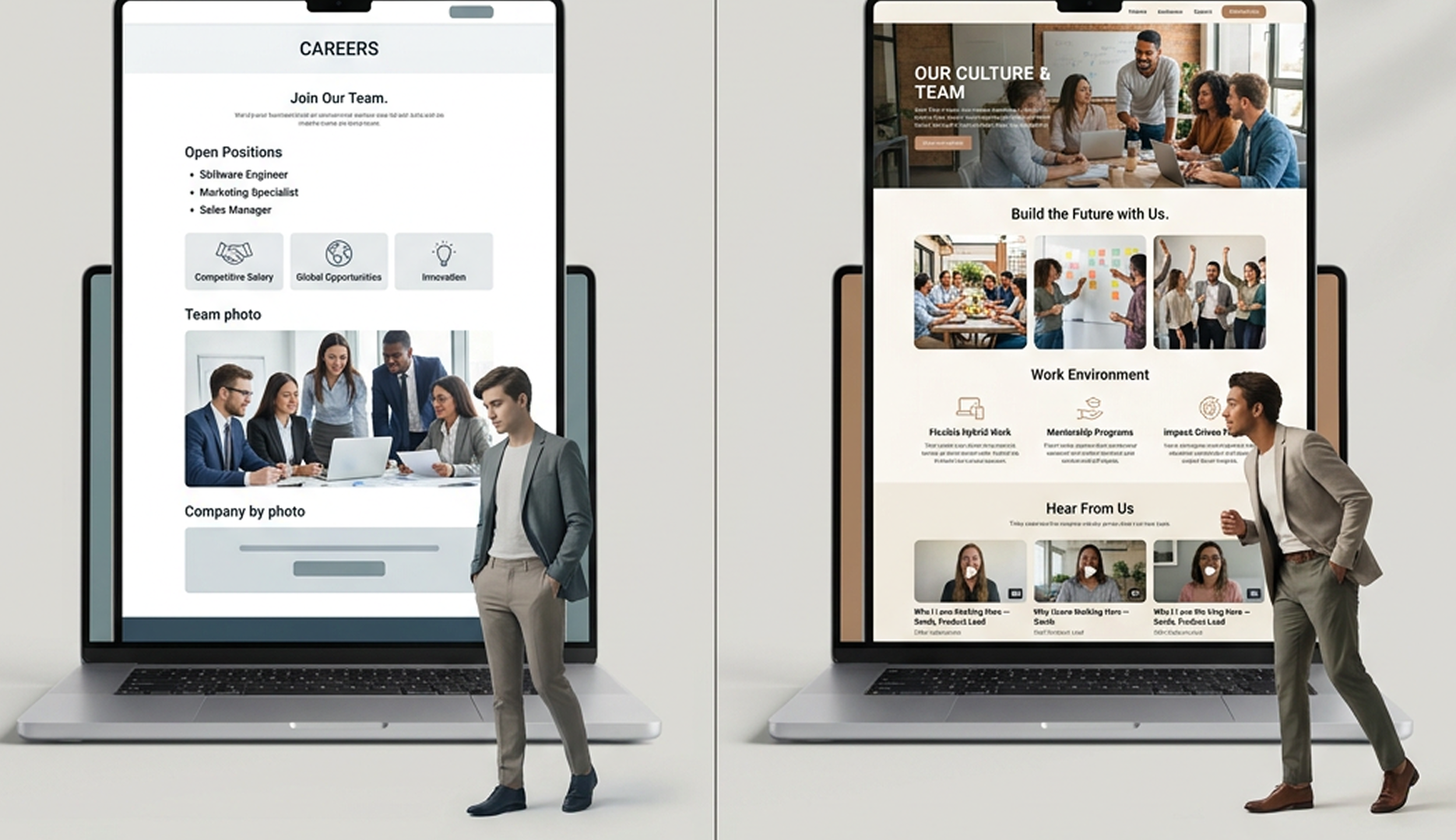
Client testimonials, logos of well-known clients, concrete results. Whatever you have, it should be visible on the homepage — ideally in the upper third. Not because it is advertising, but because it helps the visitor make a decision.
Not three. Not five. One.
The homepage has one job: guide the visitor to the next step. And that next step must be crystal clear. "Schedule a free initial consultation" is a clear CTA. "Learn more" is not.
That does not mean there cannot be other links on the page. But the primary CTA should stand out visually and appear multiple times throughout the page. It is the thread that guides the visitor through the entire site.
Between the first impression and making contact, there is a trust gap. The visitor thinks: "Sounds good. But can they actually deliver? And is this the right fit for me?"
You close that gap with content that demonstrates competence without selling. Short case studies that describe a problem and its solution. Explanations of your approach. Answers to the most common objections. Everything that helps the visitor reduce their uncertainty.
A clear navigation is not a design detail. It is a strategic decision. Every menu item is a decision the visitor has to make. And every decision costs mental energy.
Seven menu items are the maximum in most cases. Anything beyond that dilutes the guidance and increases the likelihood that the visitor clicks around aimlessly or leaves the page.
More than half of all website visits now come from mobile devices. And "responsive" is not enough. Responsive means the page adapts to the screen. Mobile-optimized means the page works just as well on a smartphone as on a desktop.
That affects font sizes, button sizes, form lengths, and the order of content. On a desktop, a three-column section looks good. On a smartphone, it becomes an endless scroll. The structure must be consciously planned for mobile use, not just technically adapted.
Go through your current homepage and answer for each element: Is it there? Is it visible? And does it work?
If you hesitate on more than two elements, that is a clear signal that your homepage is leaving potential untapped. Not because it is bad. But because it could be better.
As CFO, Christian is responsible for the business side of Iridium Works. Over the years, he has built and managed several companies. Christian writes about digitalization, sales, and current market trends, and how Iridium's services impact its customers.
Access our exclusive whitepapers, expert webinars, and in-depth articles on the latest breakthroughs and strategic implications of webdesign, software development and AI.